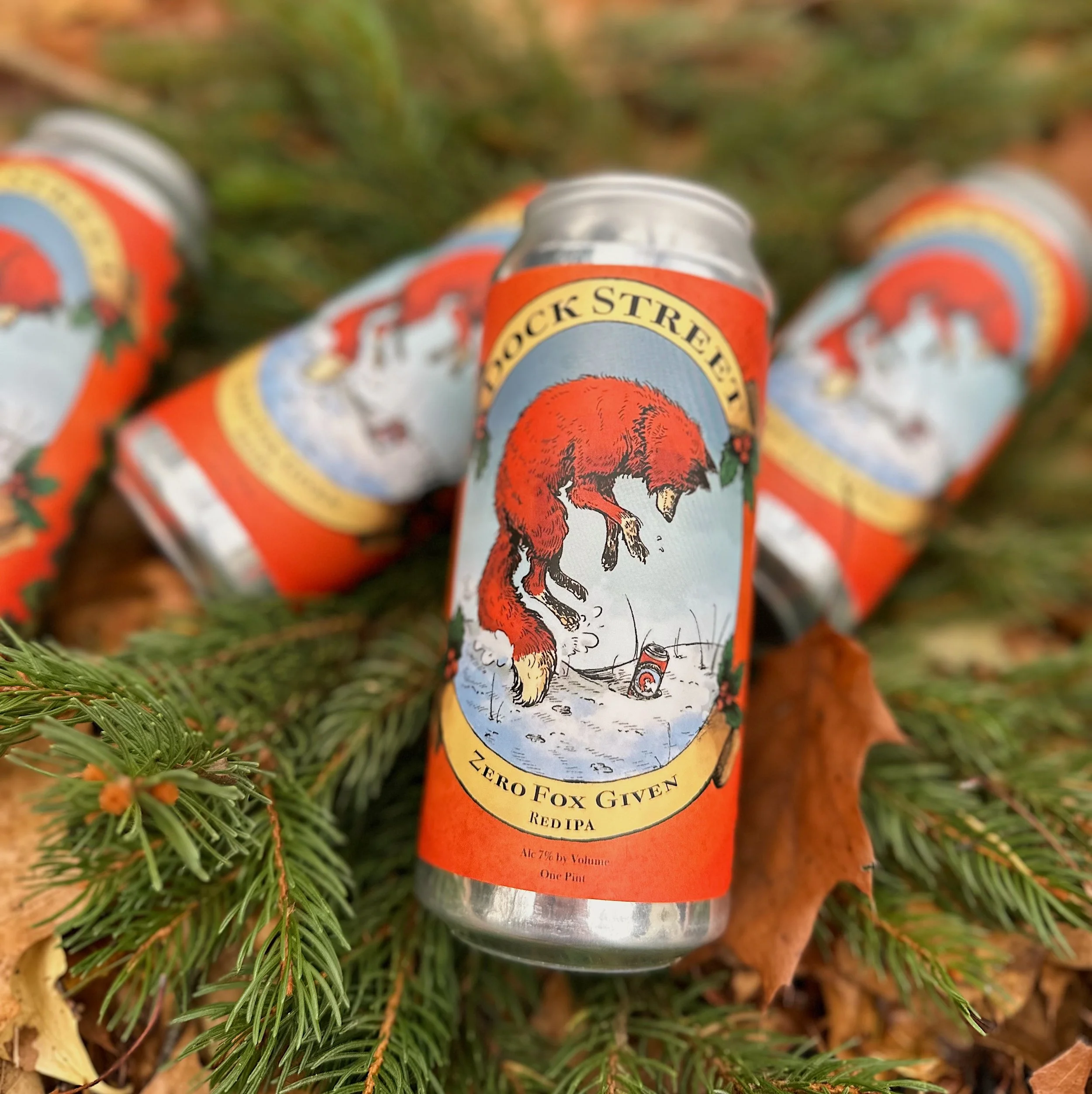
Dock Street Zero Fox Given is back, with label art by Moore Alum Hadley Precht.
Last year, in the early fall of 2024, Dock Street partnered with Moore College of Art and Design and professor Joe Kulka (who is also a talented book illustrator!). We received over two dozen submissions from Kulka’s students as part of their semester coursework, and we (painstakingly) chose a winner - this gorgeous red fox depicted in mid-pounce by then-senior Hadley Precht, who has since graduated. We’re thrilled to bring this beautiful can back for a second year in a row, right in time for the coziest season of the year.
We spoke with Hadley about her inspo behind the artwork, particularly why she chose a fox for this beer. To note, the artwork came first, followed by a name for the beer - the prompt was a “jubilant red IPA”.
TELL US ABOUT THIS LABEL, AND WHY YOU CHOSE A FOX FOR THE ARTWORK, WHICH ULTIMATELY LED TO US NAMING THE BEER “ZERO FOX GIVEN”.

“I knew the beer was going to have notes of pine and oranges, which gave me foresty vibes. A lot of beers use animals in their labels so I wanted to do a forest animal that was also native to PA, since Dock Street is Philly-based! I chose a red fox, as I wanted the coat to symbolize the Red IPA. I also just liked foxes - I came from a semi-rural area before moving to Philly. Sometimes in the morning before going to school, the juvenile foxes would run through my backyard, playing just before daylight.
The fox itself is meant to represent the red beer amongst the cold of winter. The gold color of the banners surrounding it symbolize the foam at the top. I also wanted to go for an old-timey vibe of holly leaves and wreathes of pine around the can. It was actually Rosemarie's idea to incorporate hops into the pine, and I'm glad we went with that. The shapes of the hops and pinecones are similar enough to be sisterly on the can, and it reinforces the hoppy flavor that takes center stage in the beer.
The pose of the fox is meant to emulate the diving motion they do while hunting. Prey will usually be hidden in the snow during winter, and red foxes will jump and dive in to catch them. It looks a little silly, but it always looked like they were 'jumping for joy' in a way, hence why I chose it. I wanted it to symbolize joy and celebration, the kind of beer you crack open amongst loved ones. It was also suggested to me that I add a tiny version of the can in the snow, as if the fox is diving after it. It's a little like beer-ception, as I call it.

I've done miscellaneous freelance before, but I wanted to take this project as seriously as I could. I treated it like a job rather than a school assignment. Designing a beer label was a first, but I tend to work in book publishing, and labels aren't too far off from that. It just takes a lot of crossing T's and dotting I's to make sure Uncle Sam gives us the right of way.
I didn't originally design the fox to have any sort of personality per se, but when I visted Dock Street to help out with canning, Rosemarie said that it reminded her of me in some way. Maybe I accidentally made him in my image, haha! Jokes aside, this little red fellow would probably be as cunning as he could. Quick and mischievous, whatever gets the brewers to look away so he can pounce and grab a can of his own!